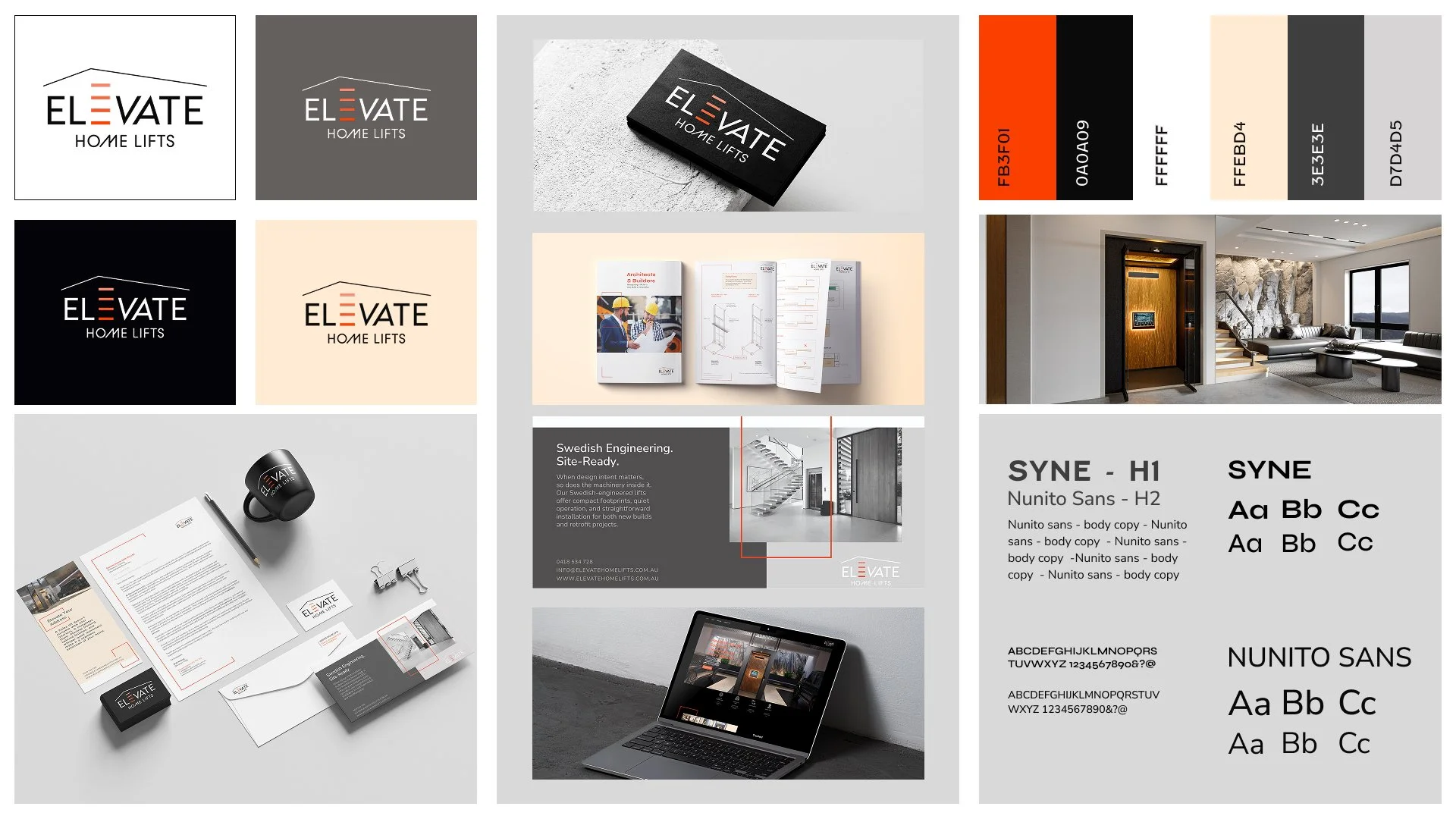
Brand Identity.
Elevate Home Lifts approached me seeking a modern, cohesive brand that reflected the Swedish quality of their lifts and the integrity of their design. Operating in a traditionally conservative industry, they needed an identity that would inspire trust in homeowners while signalling professionalism and credibility to architects and builders.
Their audience spanned design-conscious homeowners investing in long-term lifestyle solutions, as well as industry professionals who value reliability, engineering precision, and refined aesthetics. The challenge was to create a brand that felt premium and contemporary without losing a sense of technical assurance.
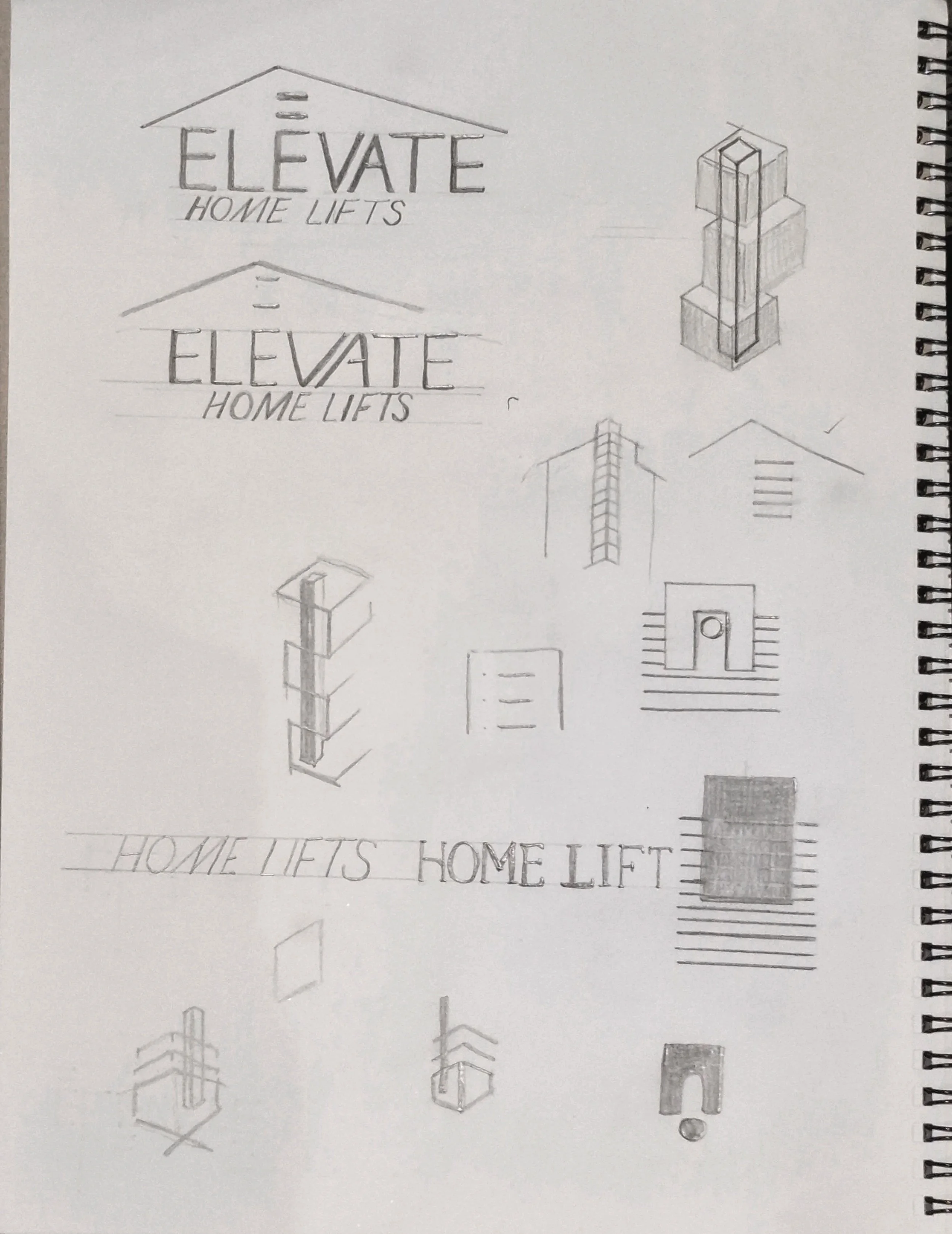
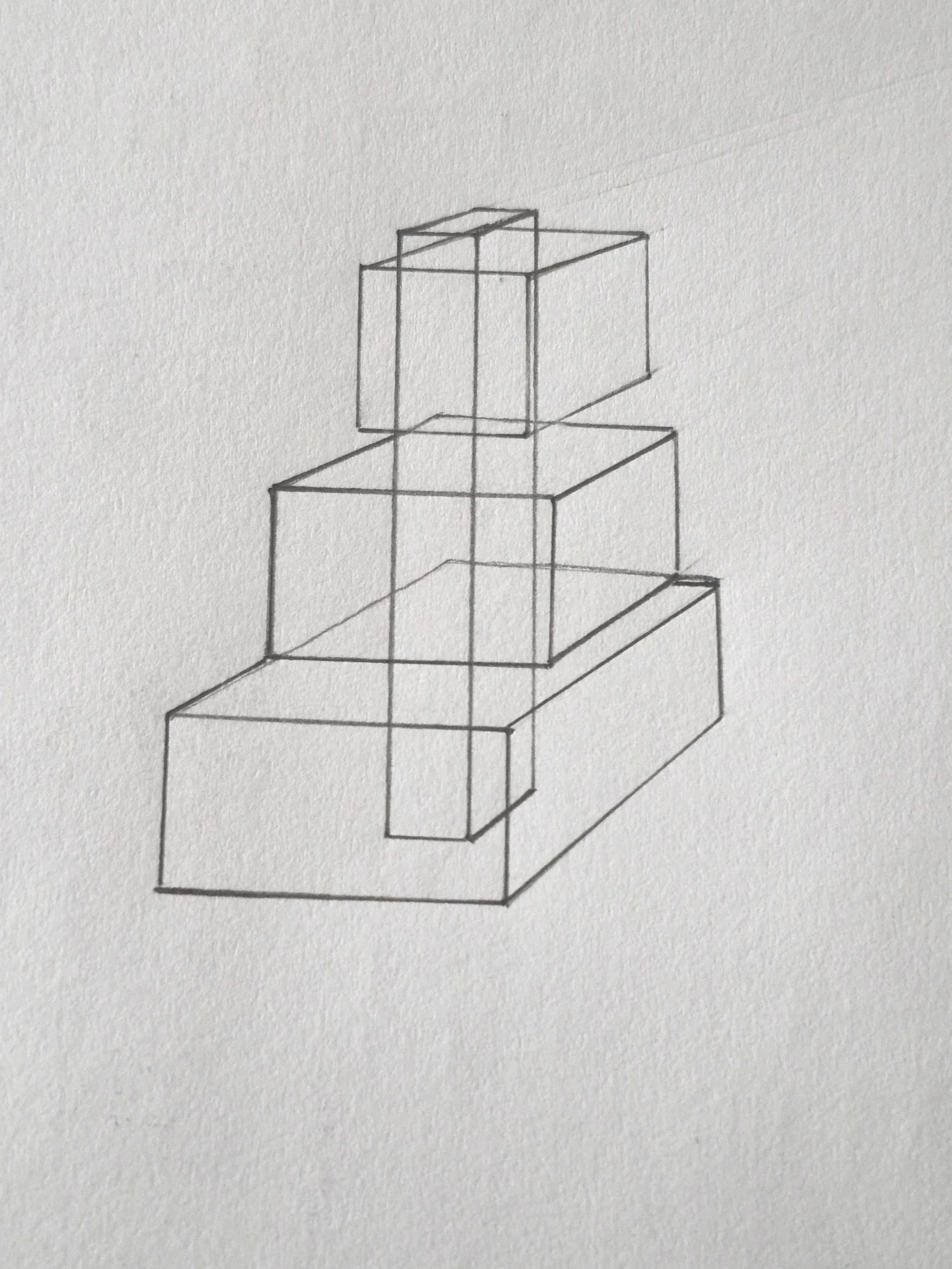
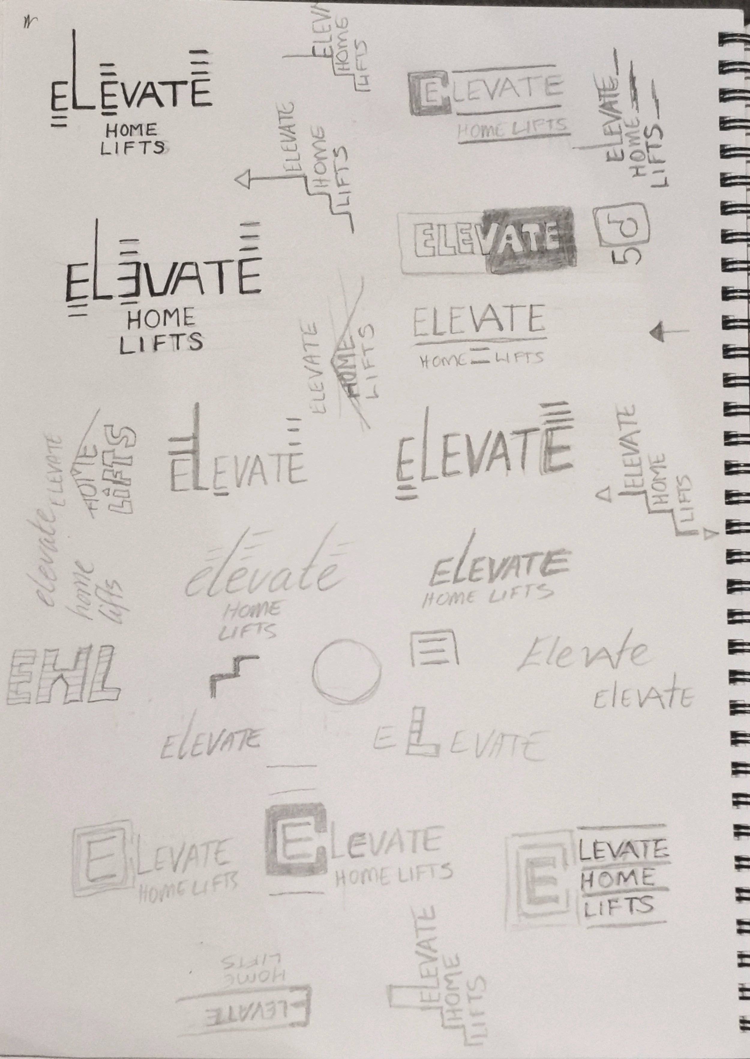
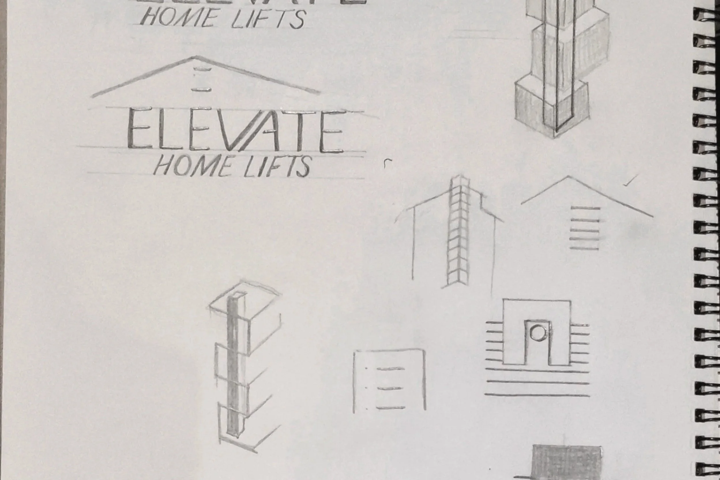
Drawing from clean Scandinavian design principles and Bauhaus-inspired geometry, I developed a visual language built on structure, clarity, and subtle distinction. Minimal forms and balanced layouts establish order and confidence, while considered details, unexpected line treatments, and a bold accent colour introduce personality and modern edge.
The result is a brand that elevates the category, positioning Elevate Home Lifts as both dependable and design-forward, refined yet confident, standing apart in a market often defined by uniformity.
Quality, Dependable, Commitment.
The brand draws inspiration from clean, minimal Scandinavian design, tempered with Bauhaus influences in line, shape, typography, and grid systems. This balance of order and creativity allowed us to convey modern elegance and movement, translating into a visual language that feels both sophisticated and approachable.
Logo studies balancing Scandi restraint with Bauhaus movement and structural energy.
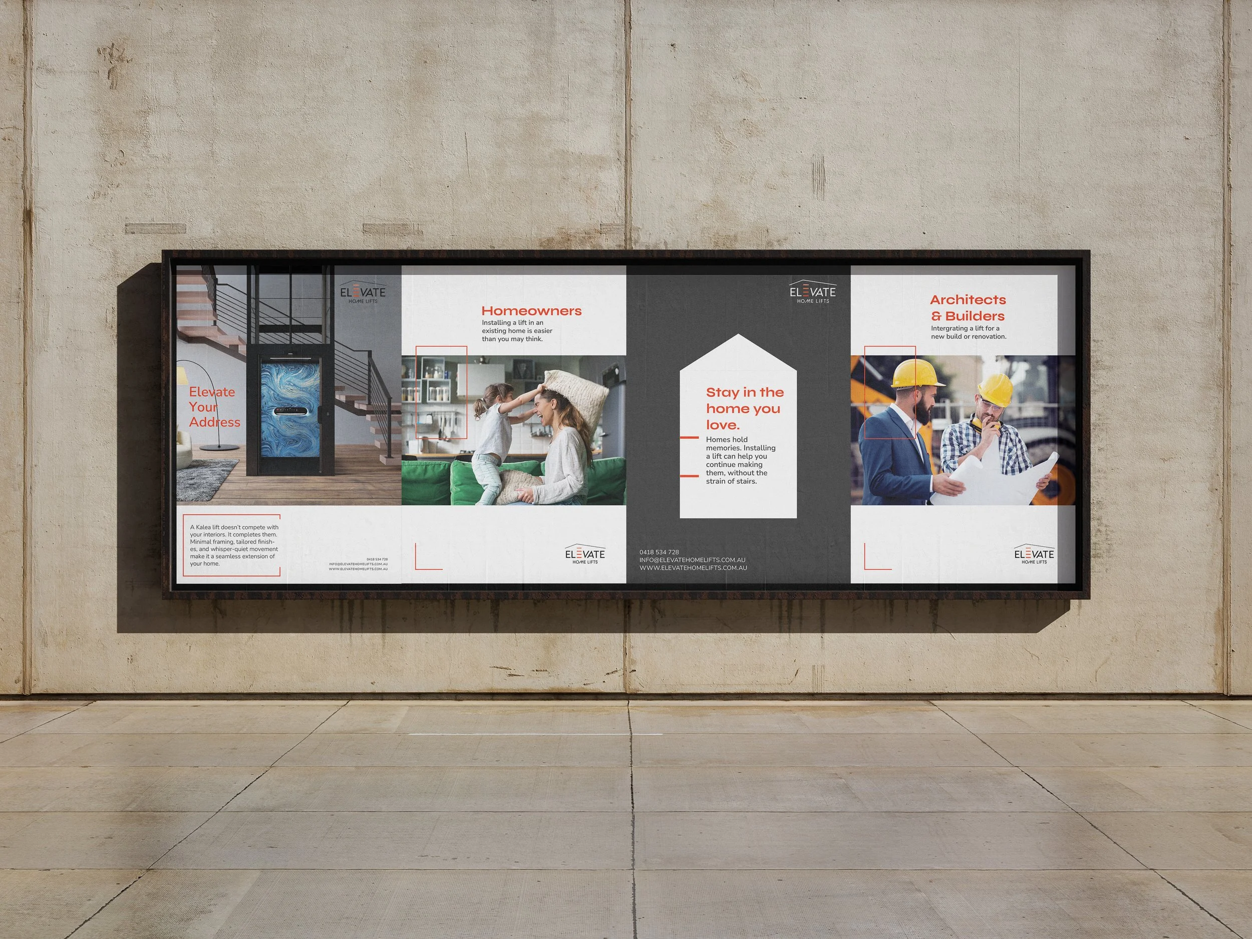
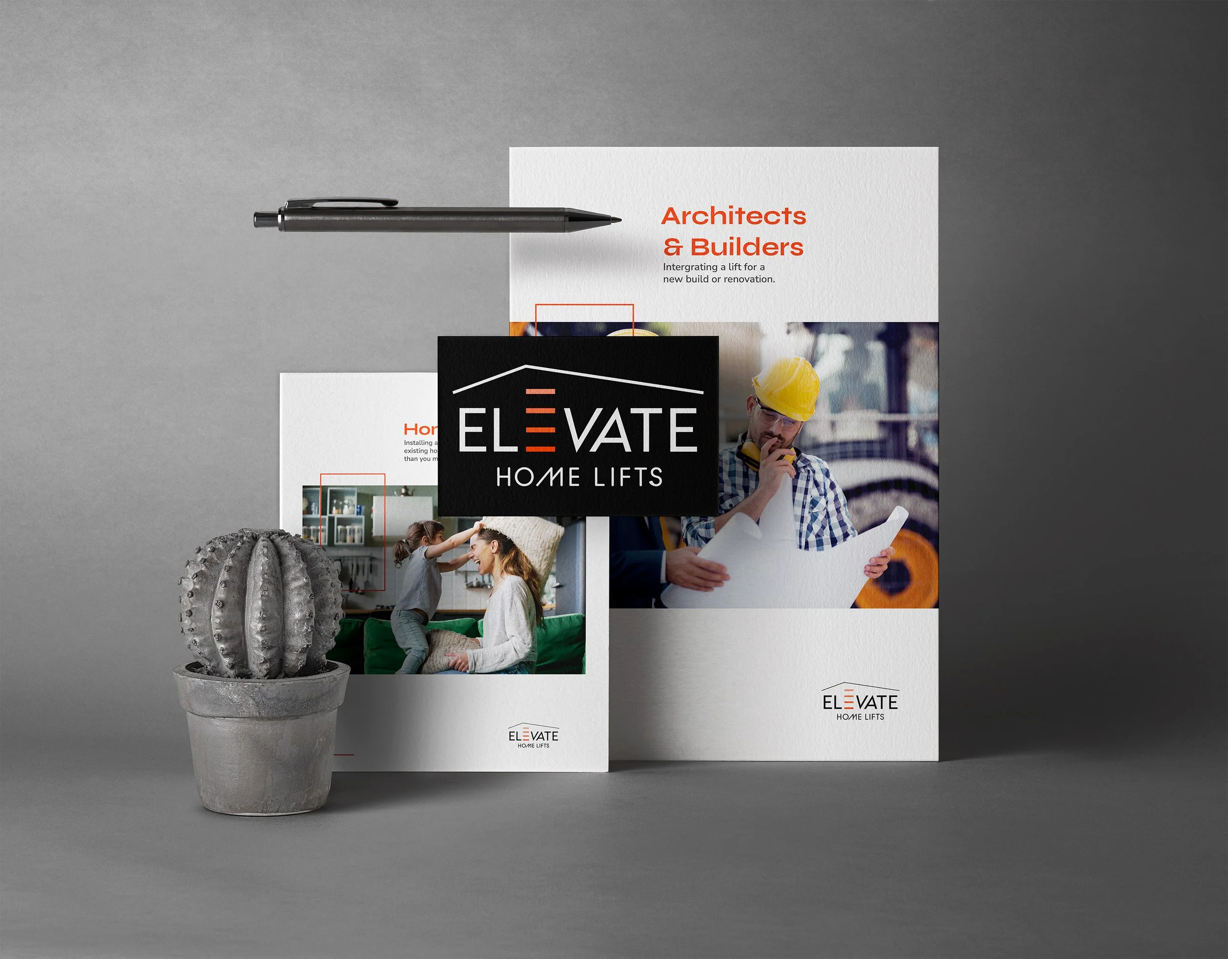
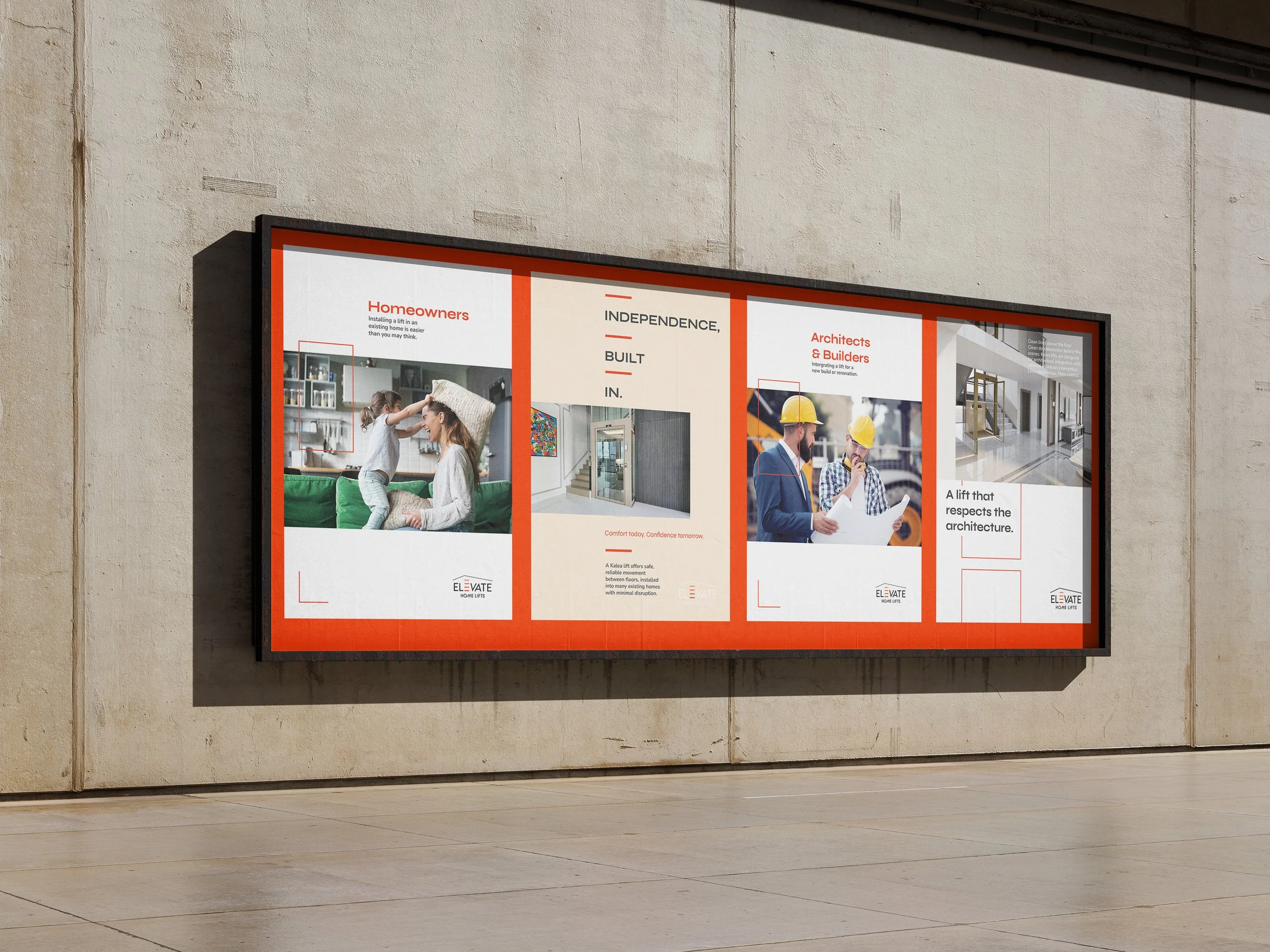
Two Audiences, One Brand.
From homeowners safeguarding or enhancing their homes to architects and builders delivering high-quality projects, the branding needed to resonate across a diverse audience while maintaining a cohesive identity.
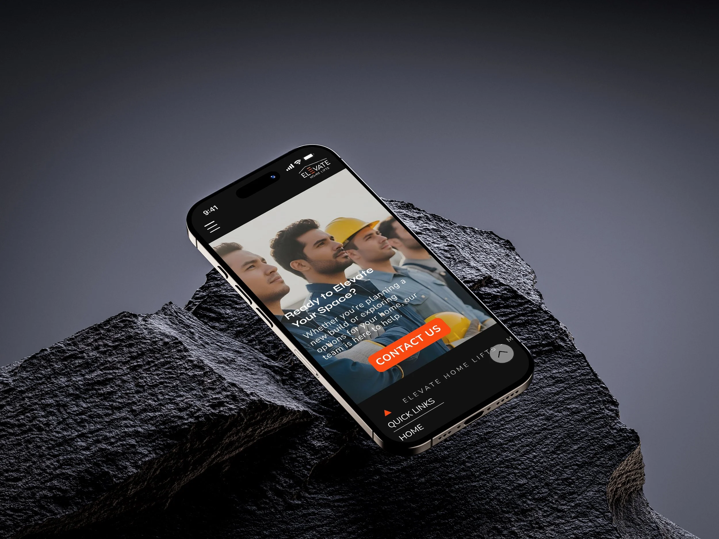
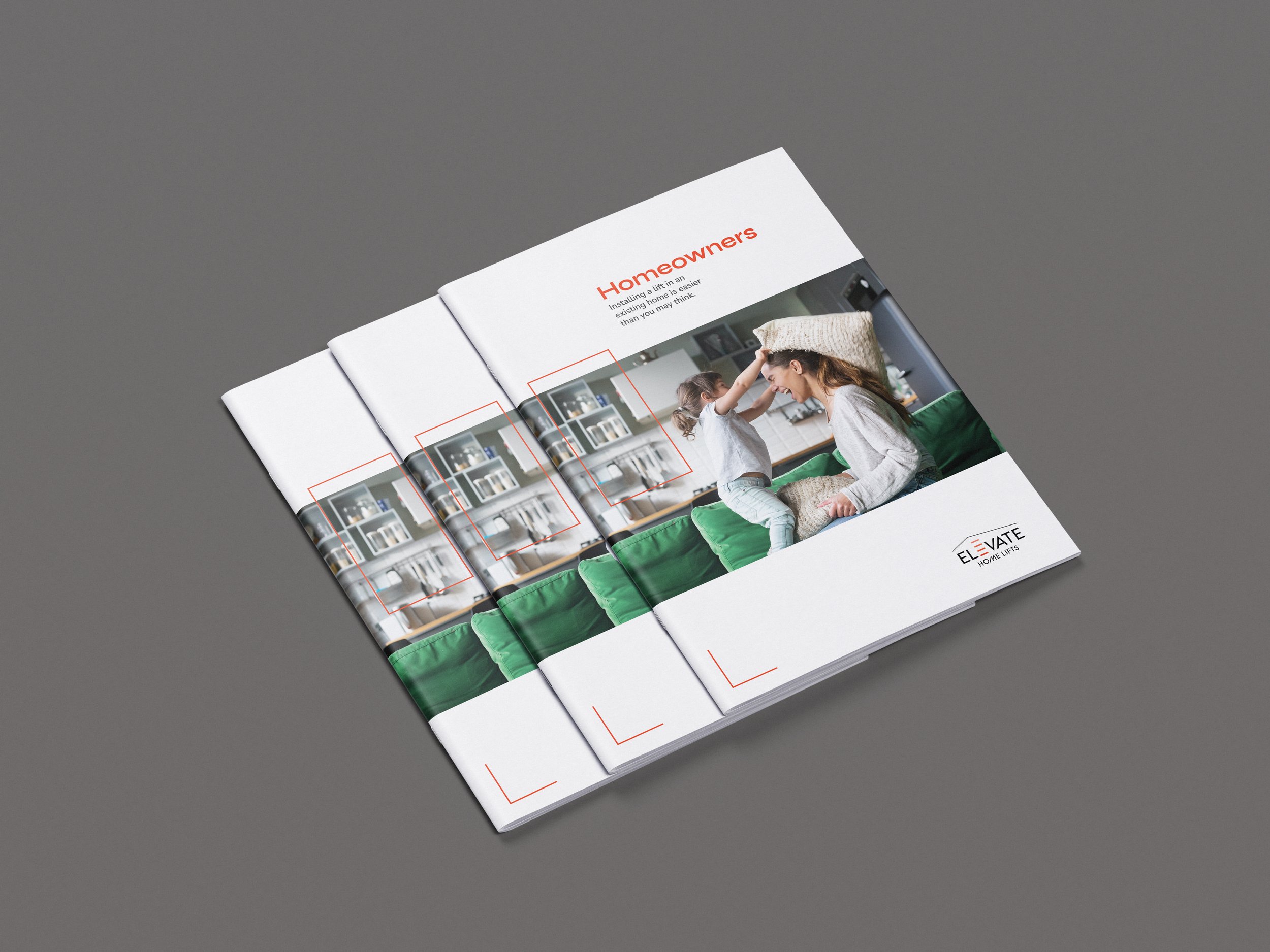
Connecting With Homeowners.
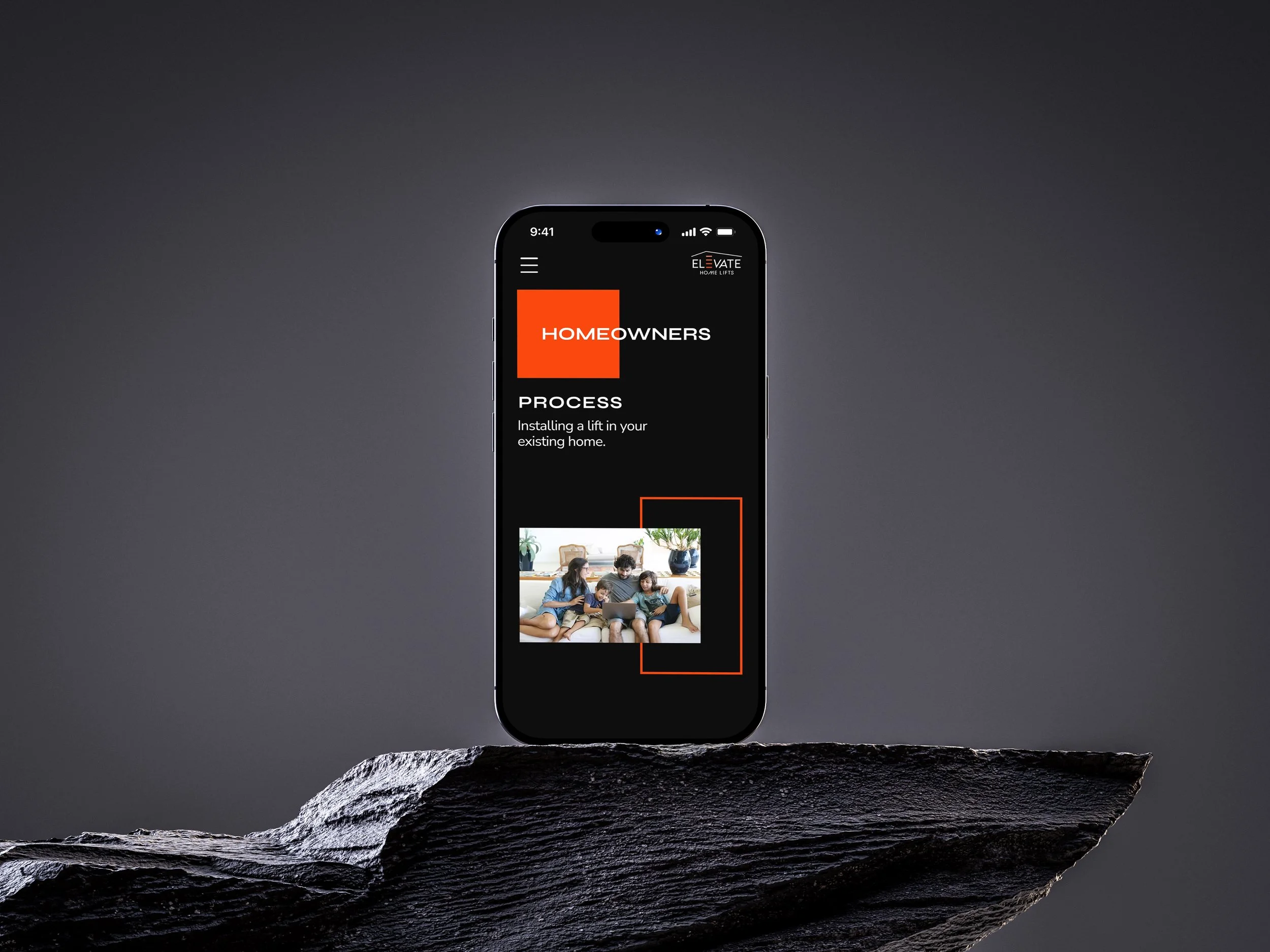
The homeowners’ experience was designed to meet people where they are. A home lift can mean different things to different households: a lifestyle upgrade, a long-term investment in accessibility, or a way to future-proof a family home.
To reflect this, the design shifts away from the technical tone used for professionals and instead focuses on warmth, relatability, and clarity. Family-focused imagery and calm, structured layouts make the information approachable while still maintaining the brand’s sense of confidence and trust.
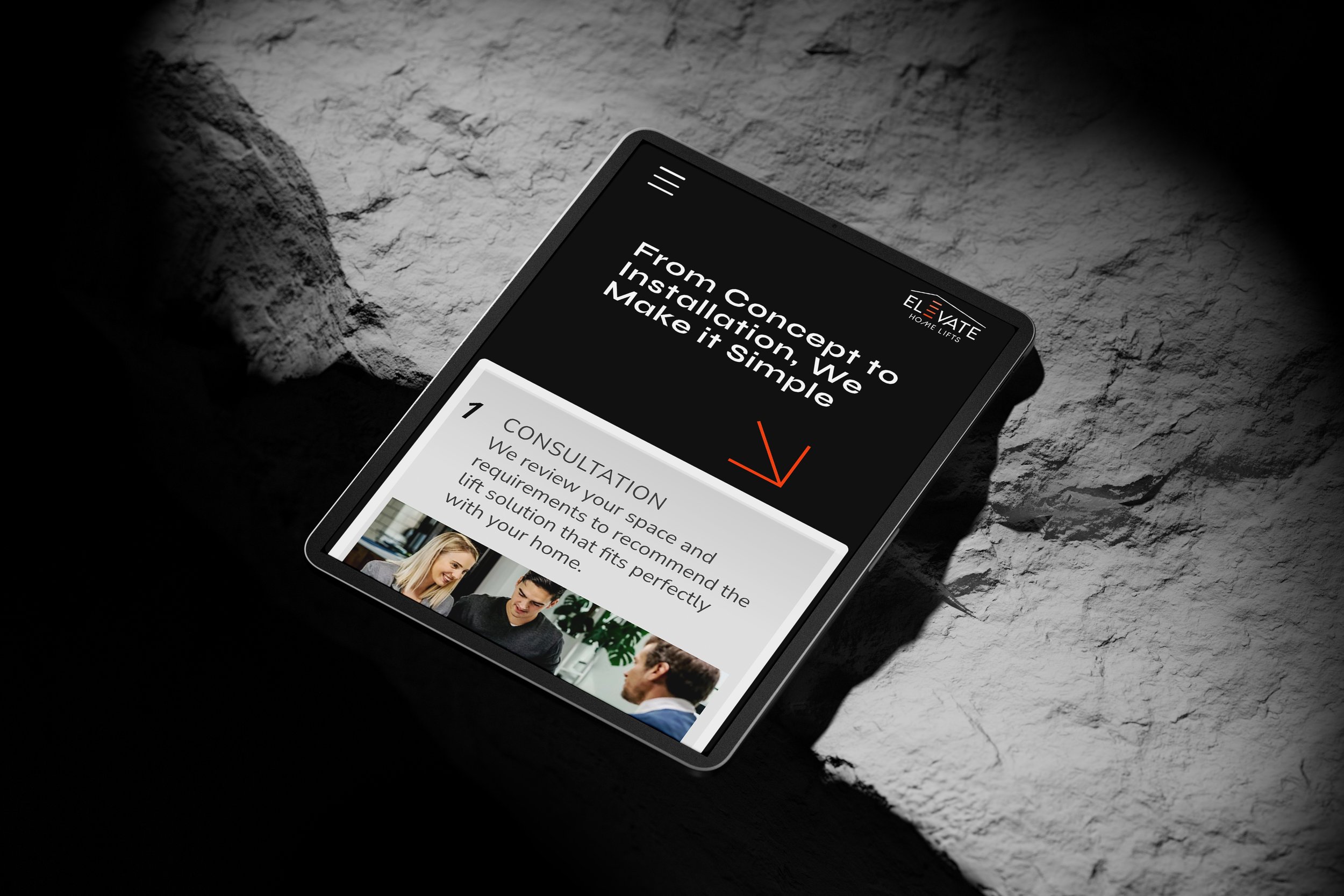
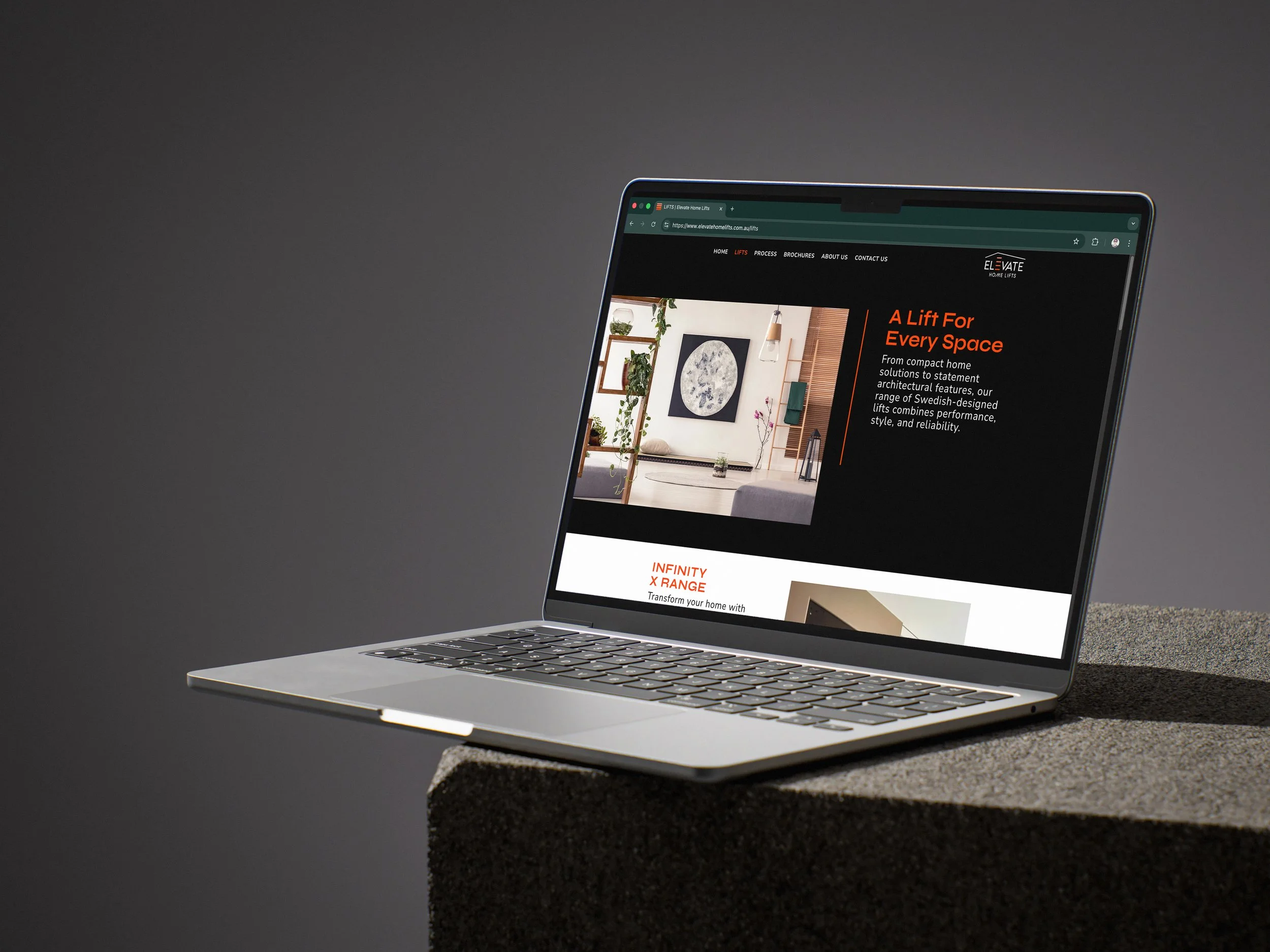
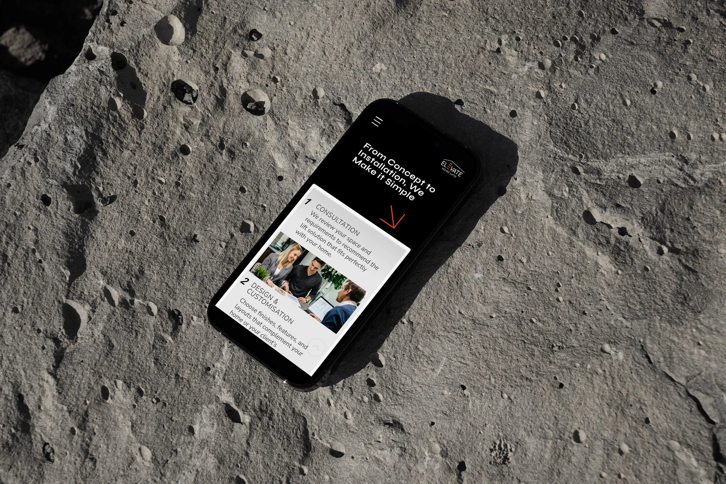
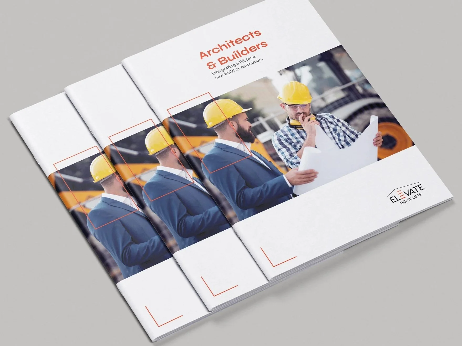
Clarity at every level.
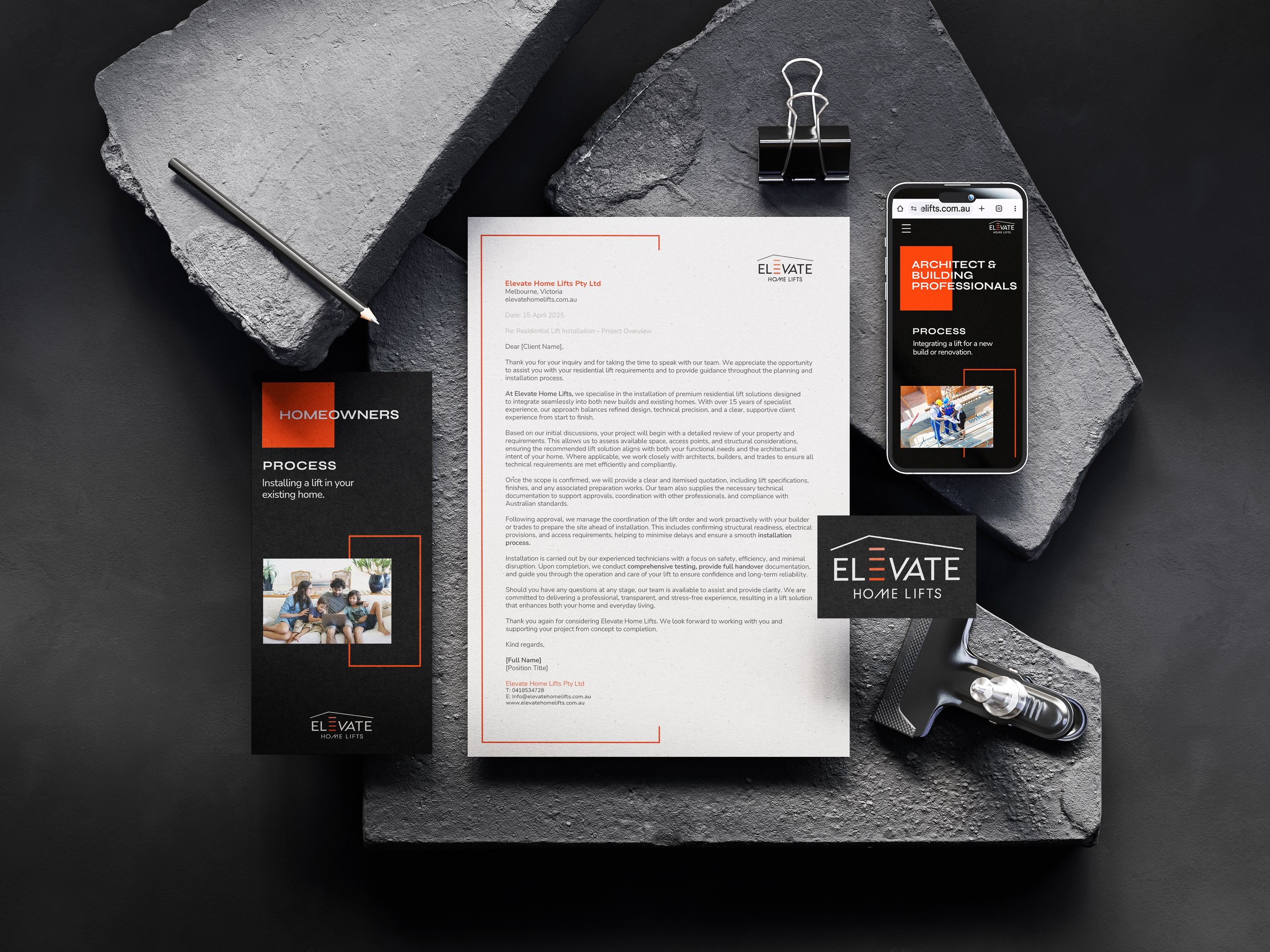
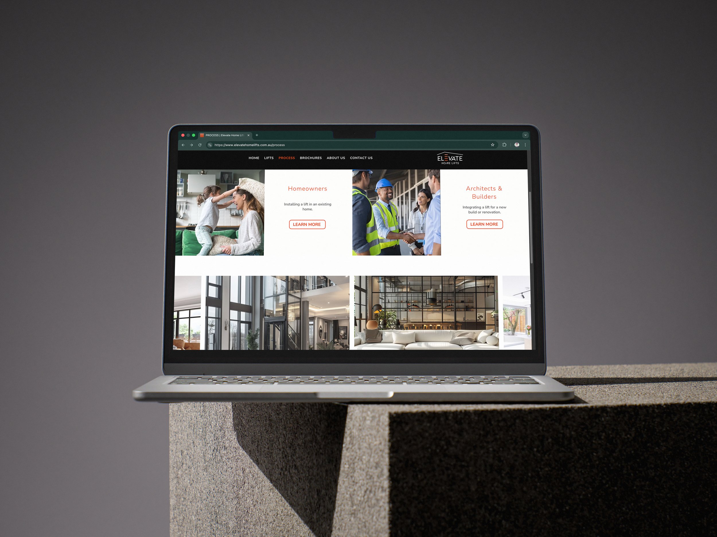
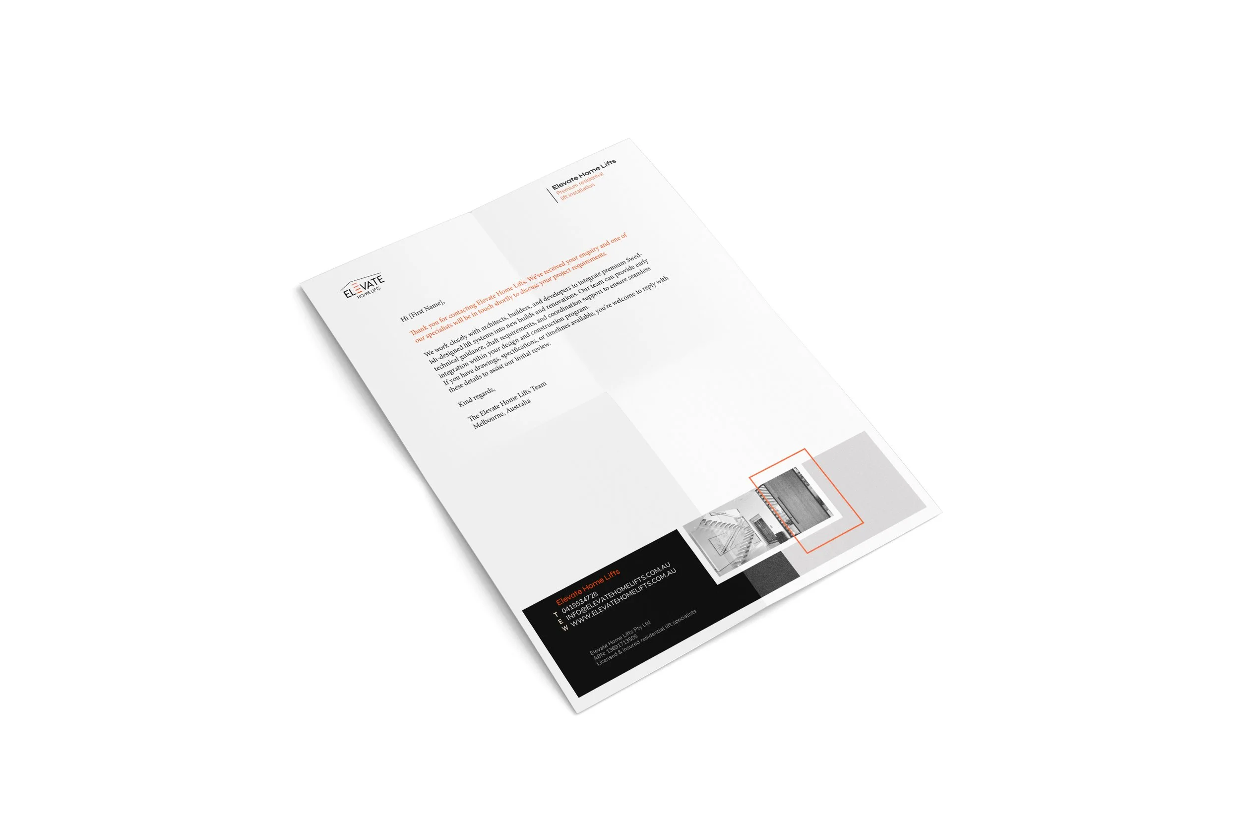
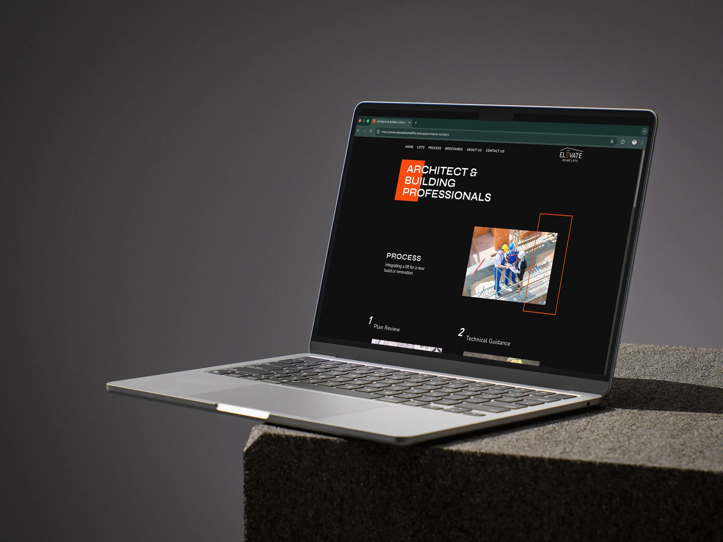
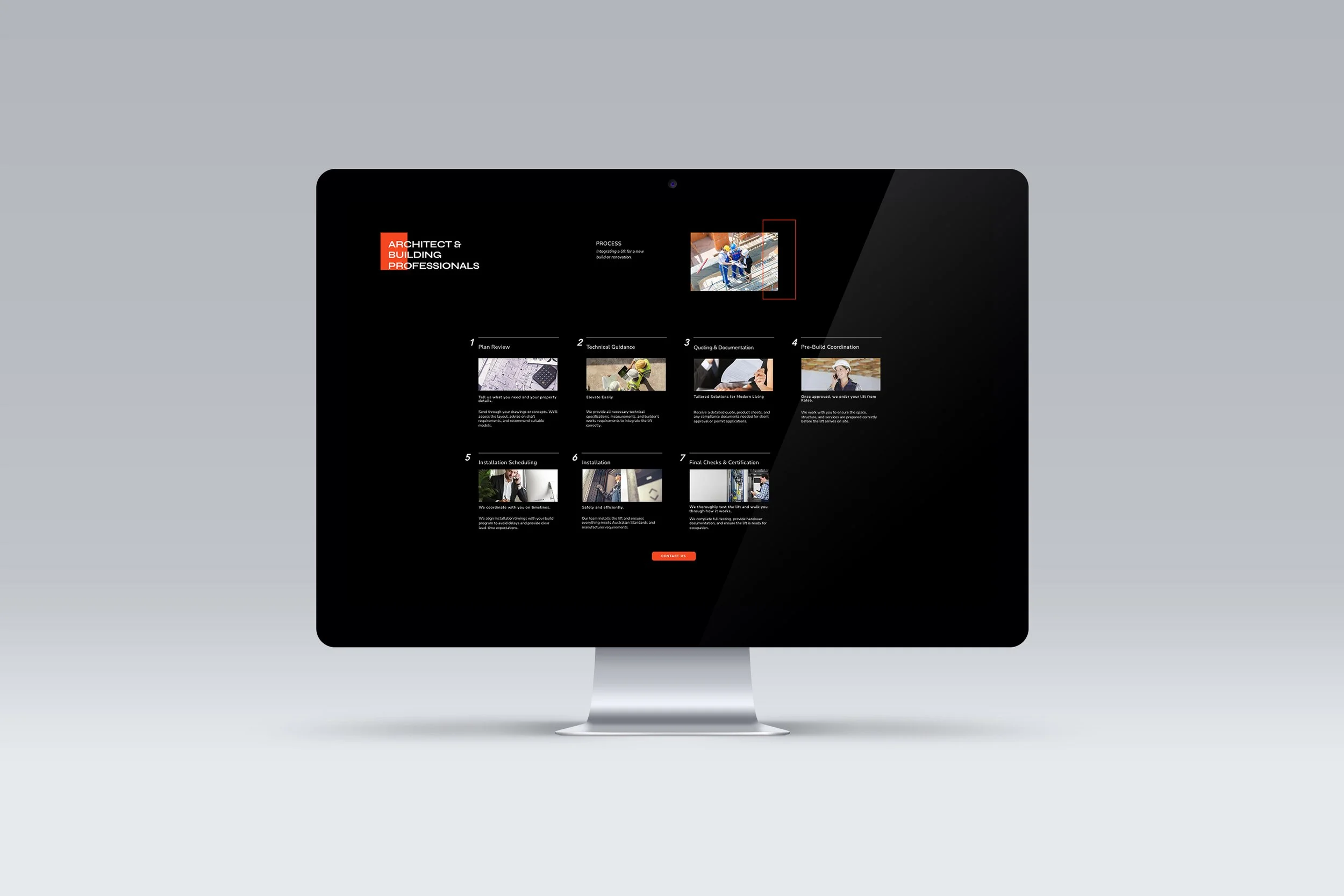
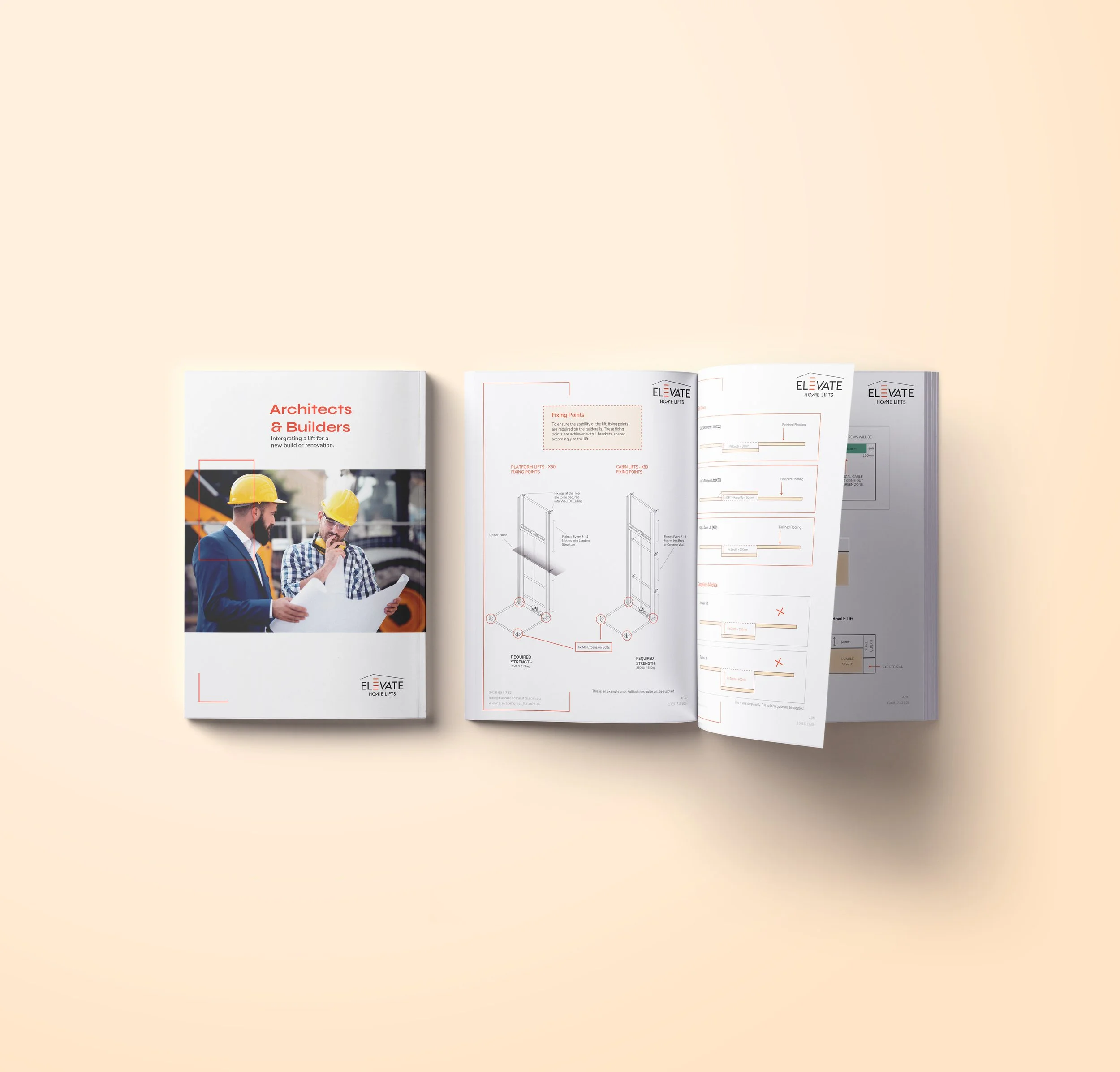
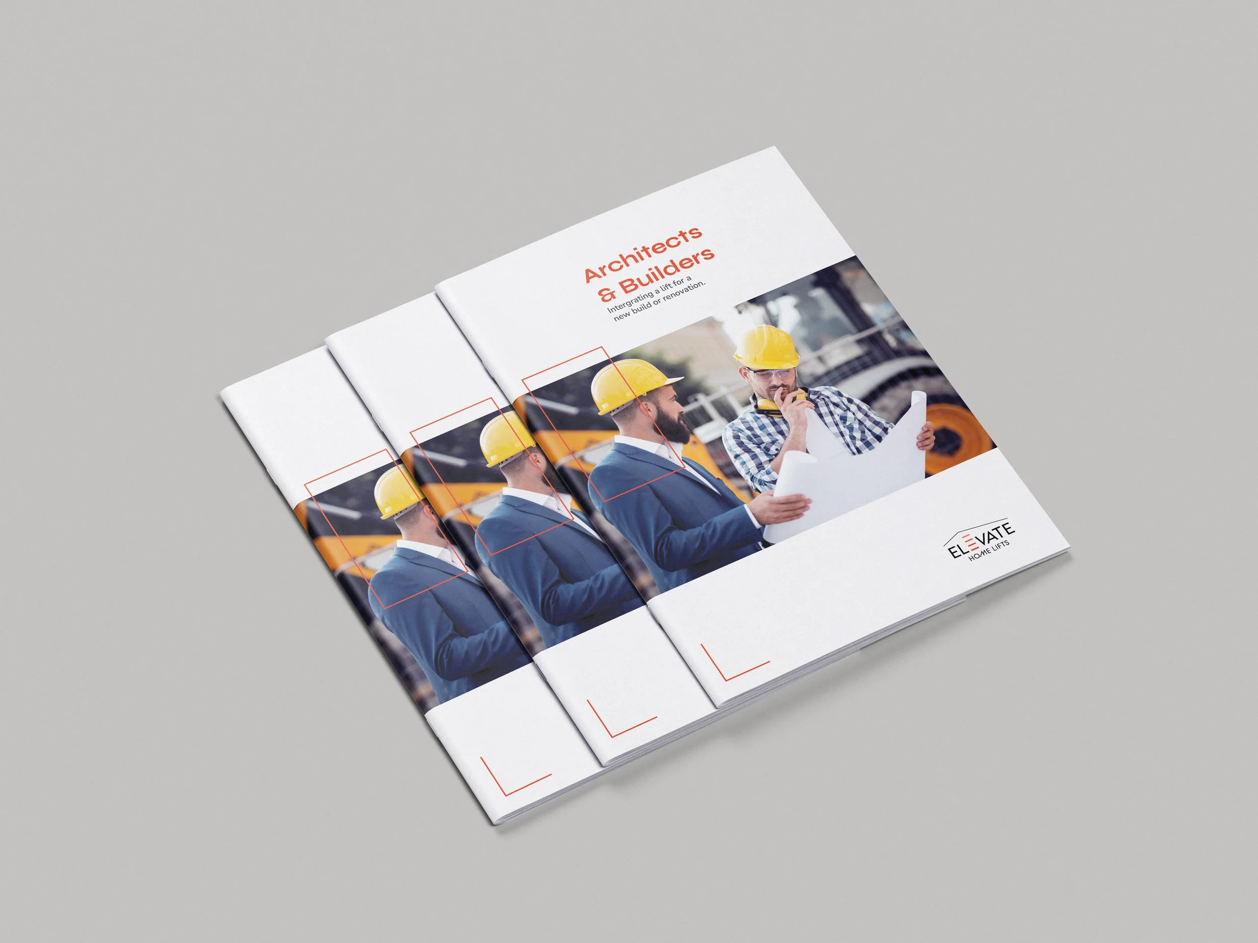
The brand needed to communicate clarity, reliability, and precision for architectural and building professionals. Clean layouts and structured typography were integral for this audience, who are often short on time and need information that is clear and easy to navigate.
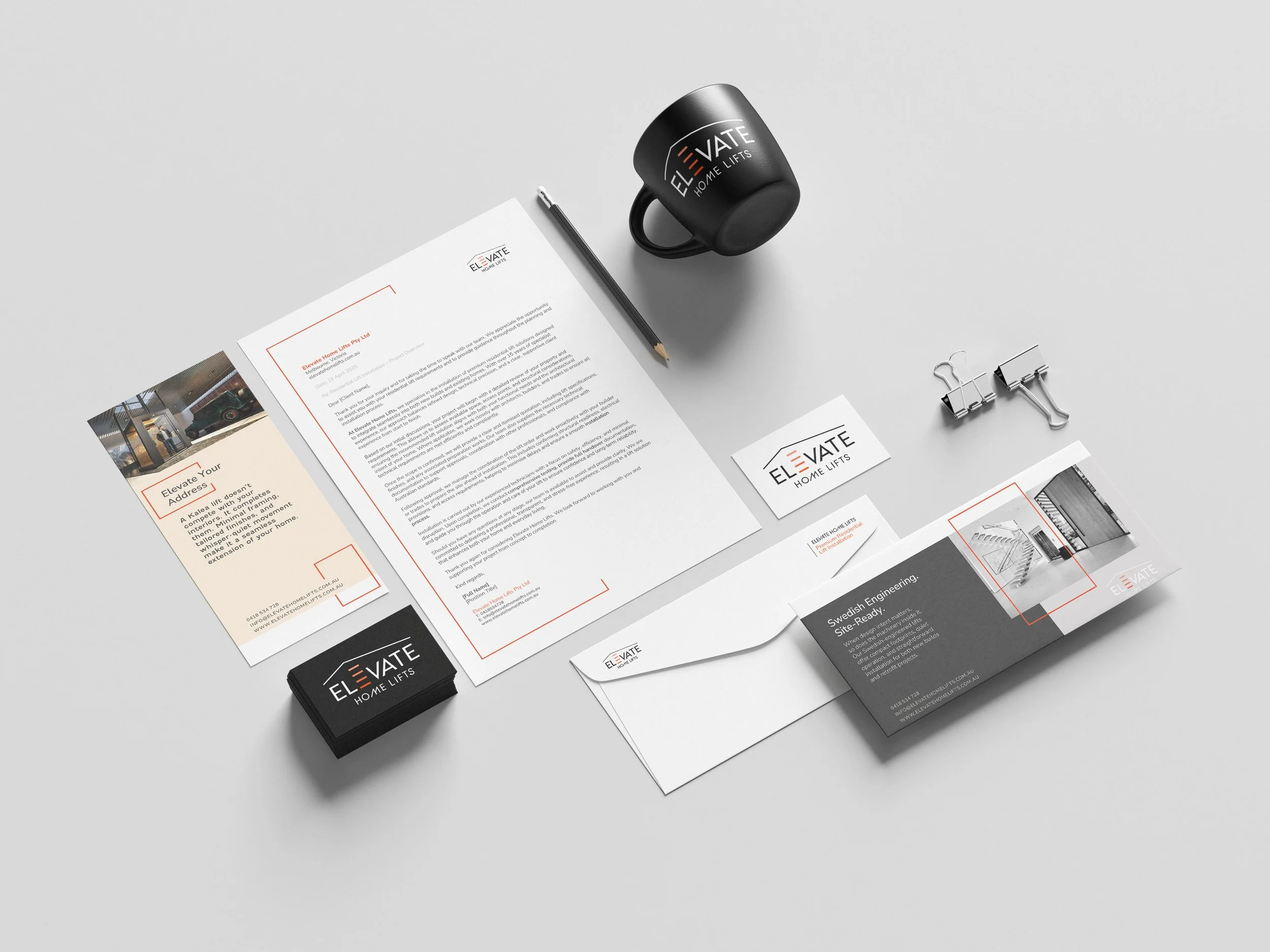
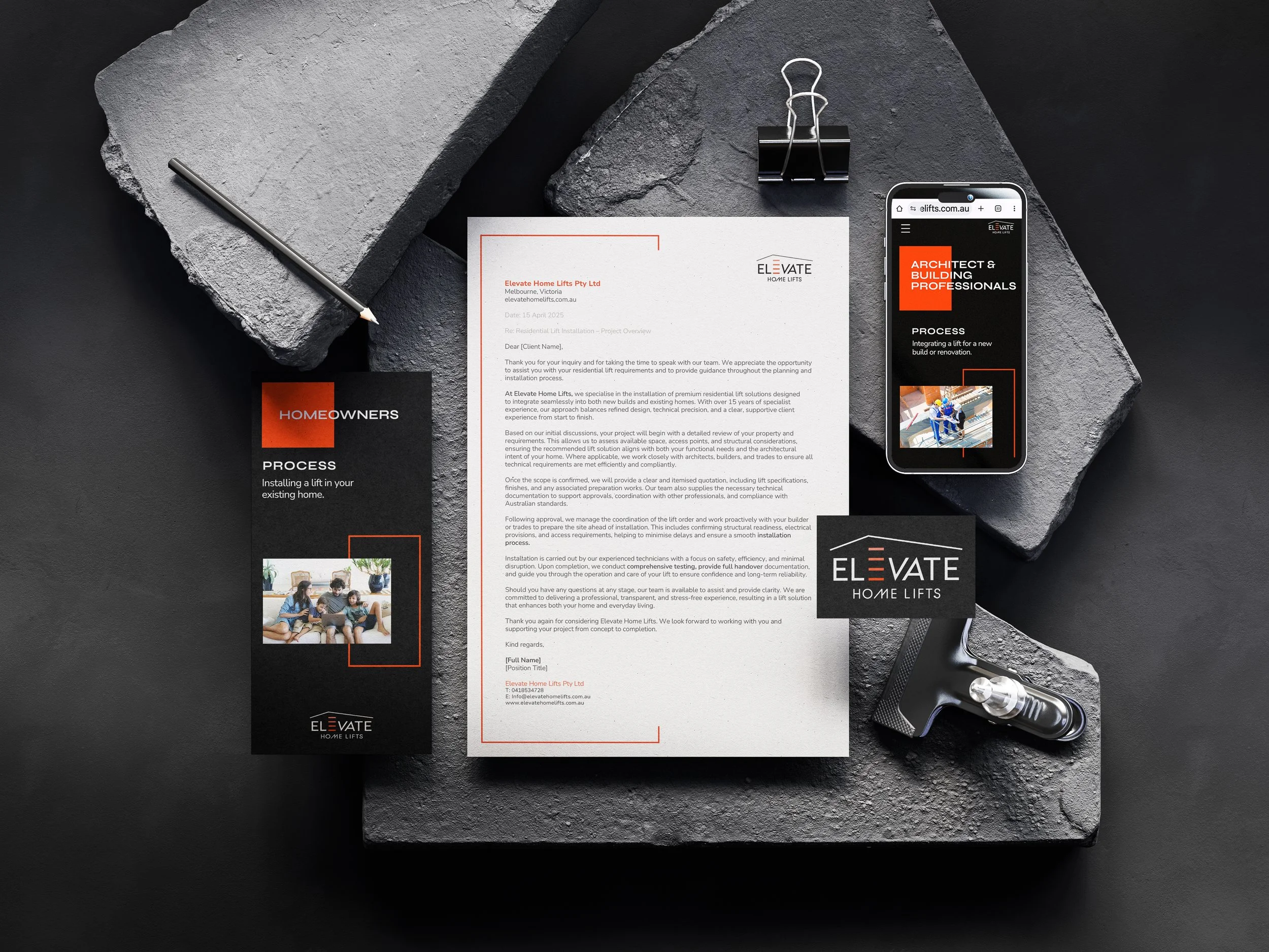
From digital presentations and process guides to technical diagrams, email templates, and branded site materials, every element of the system reinforces a cohesive, trustworthy identity.
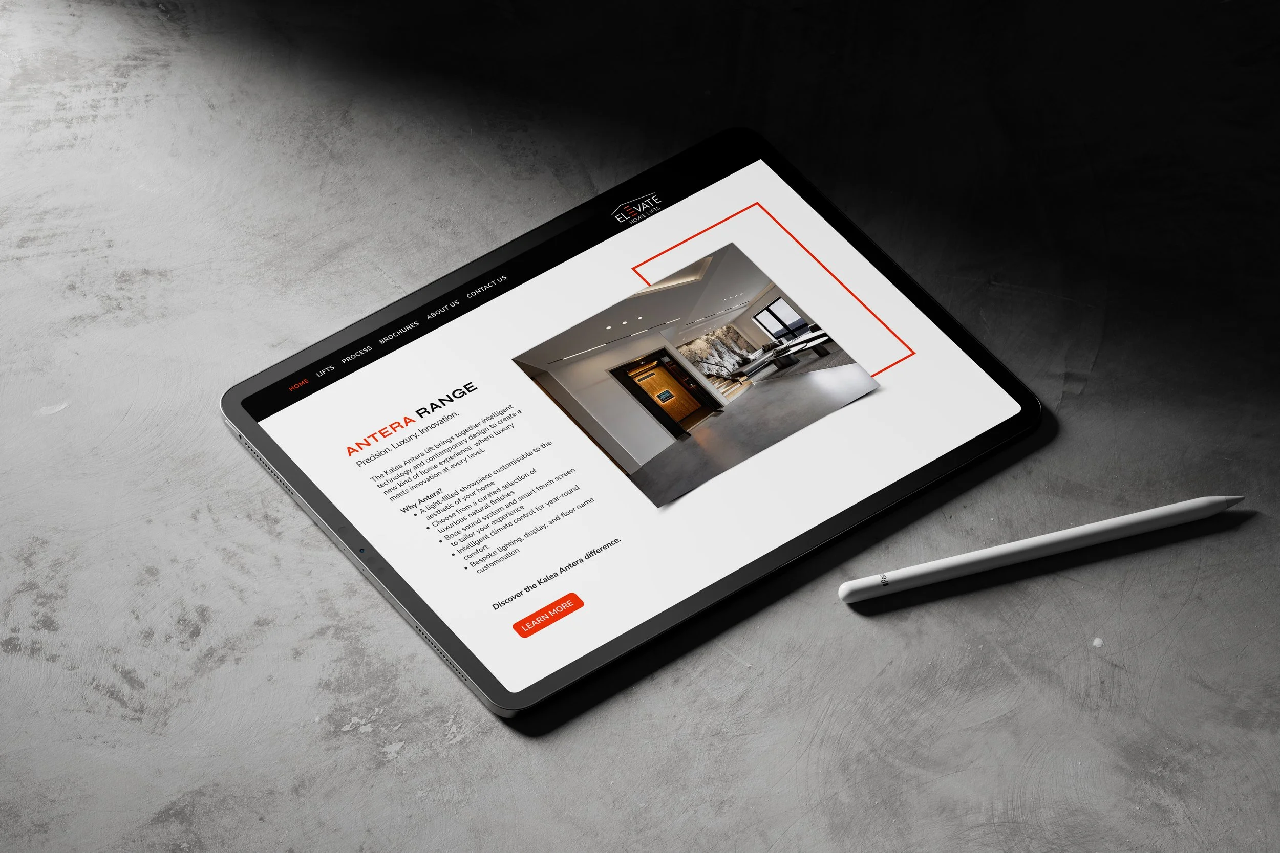
Structure Meets Simplicity.
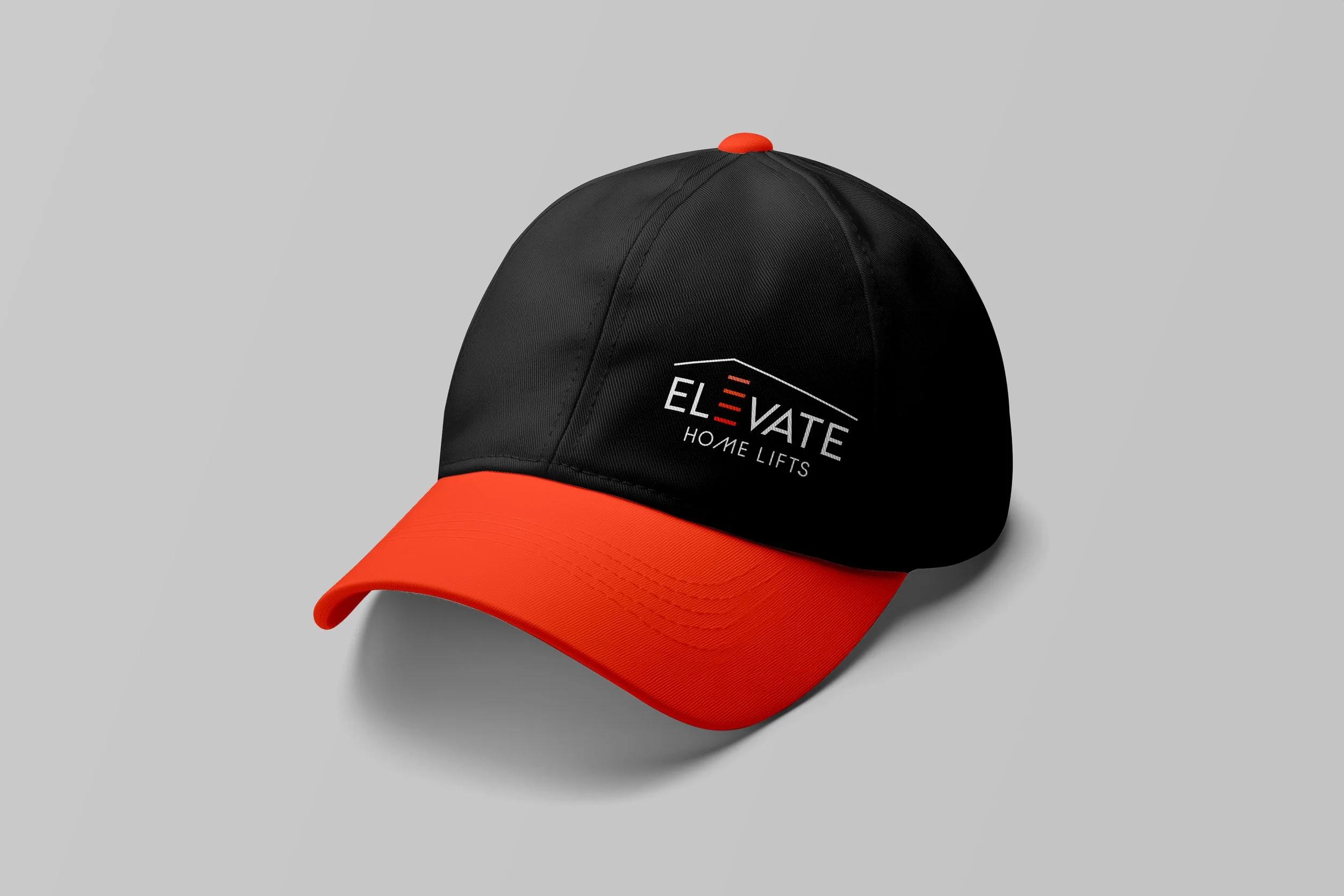
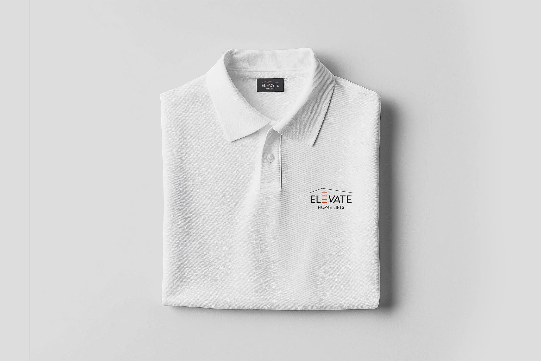
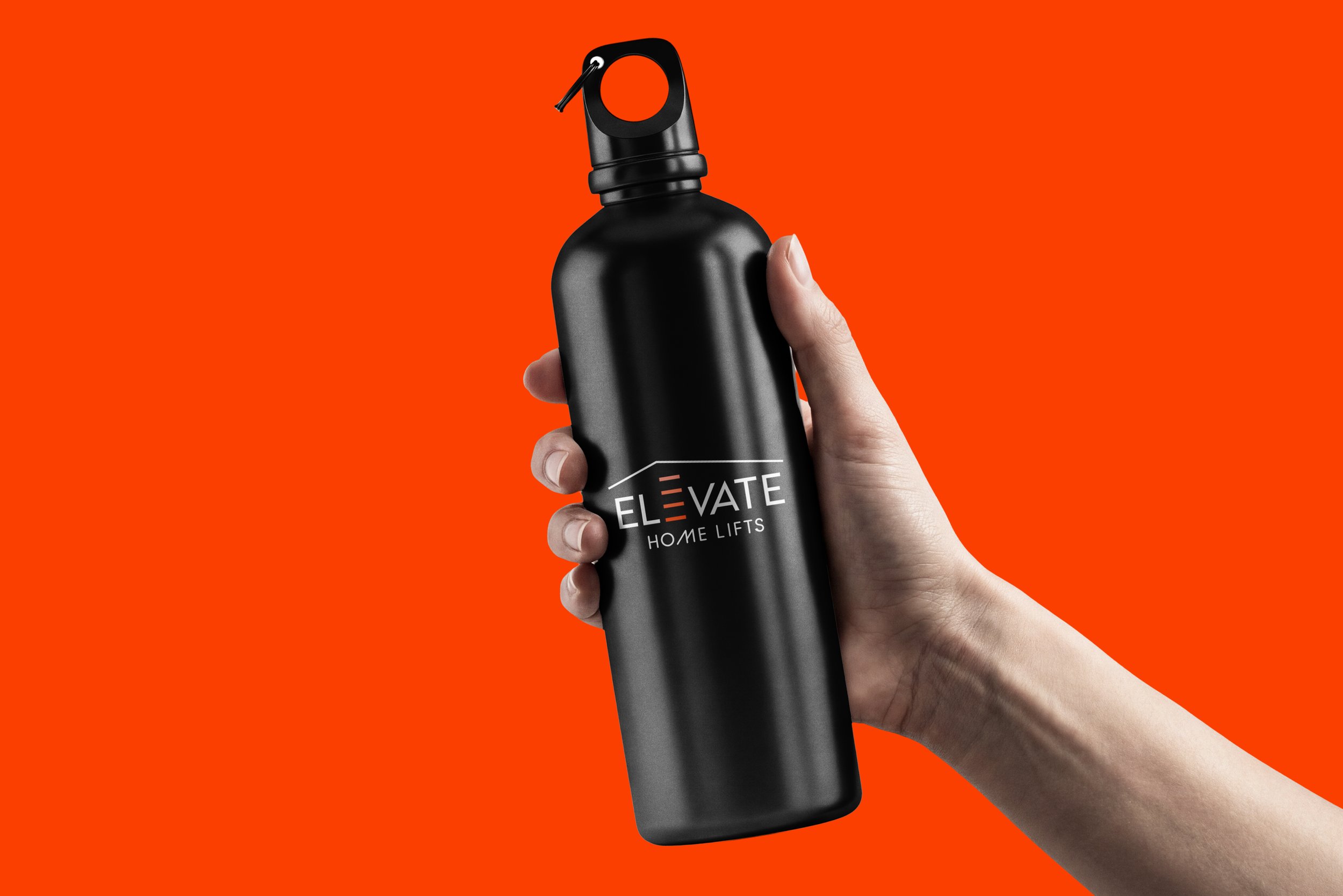
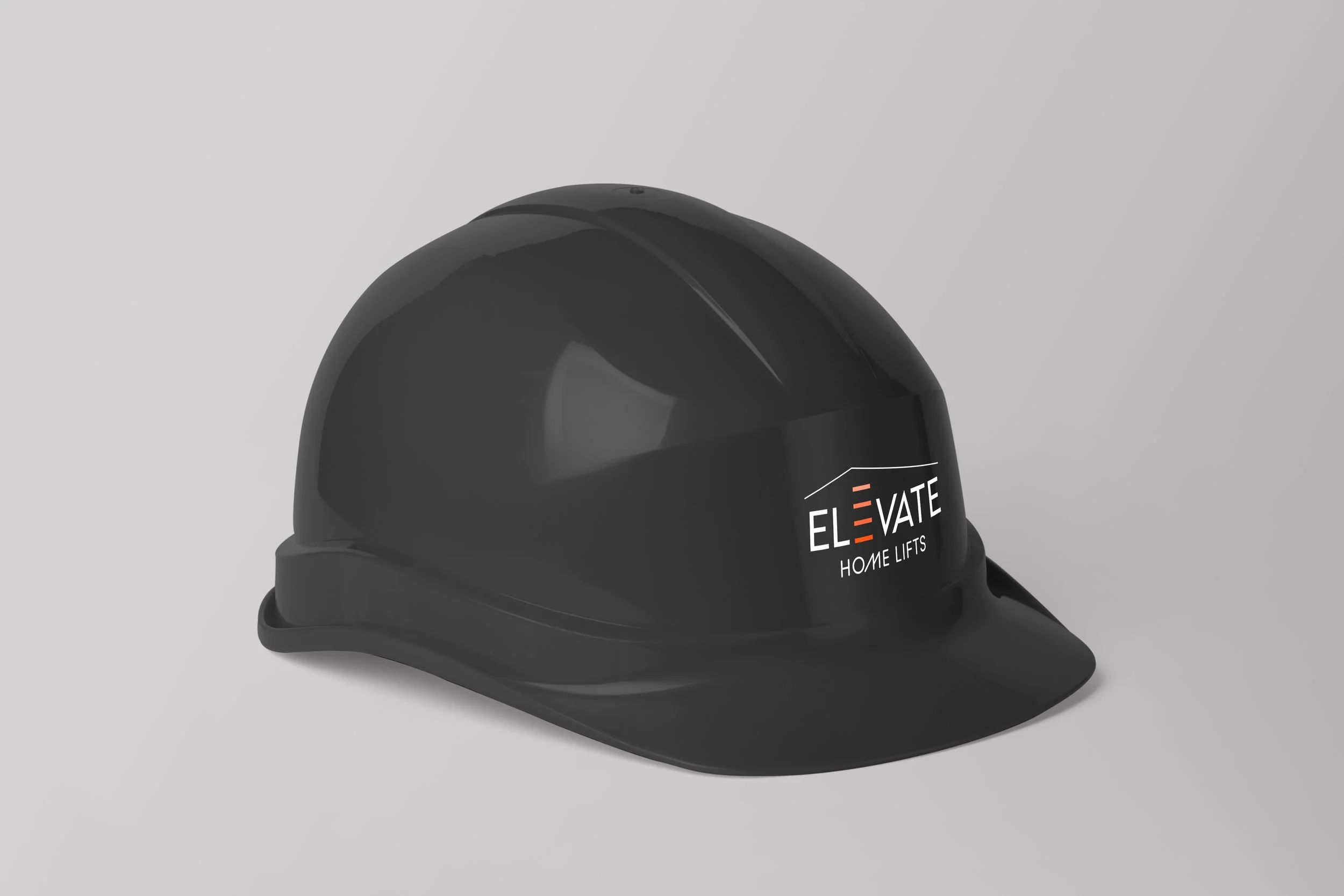
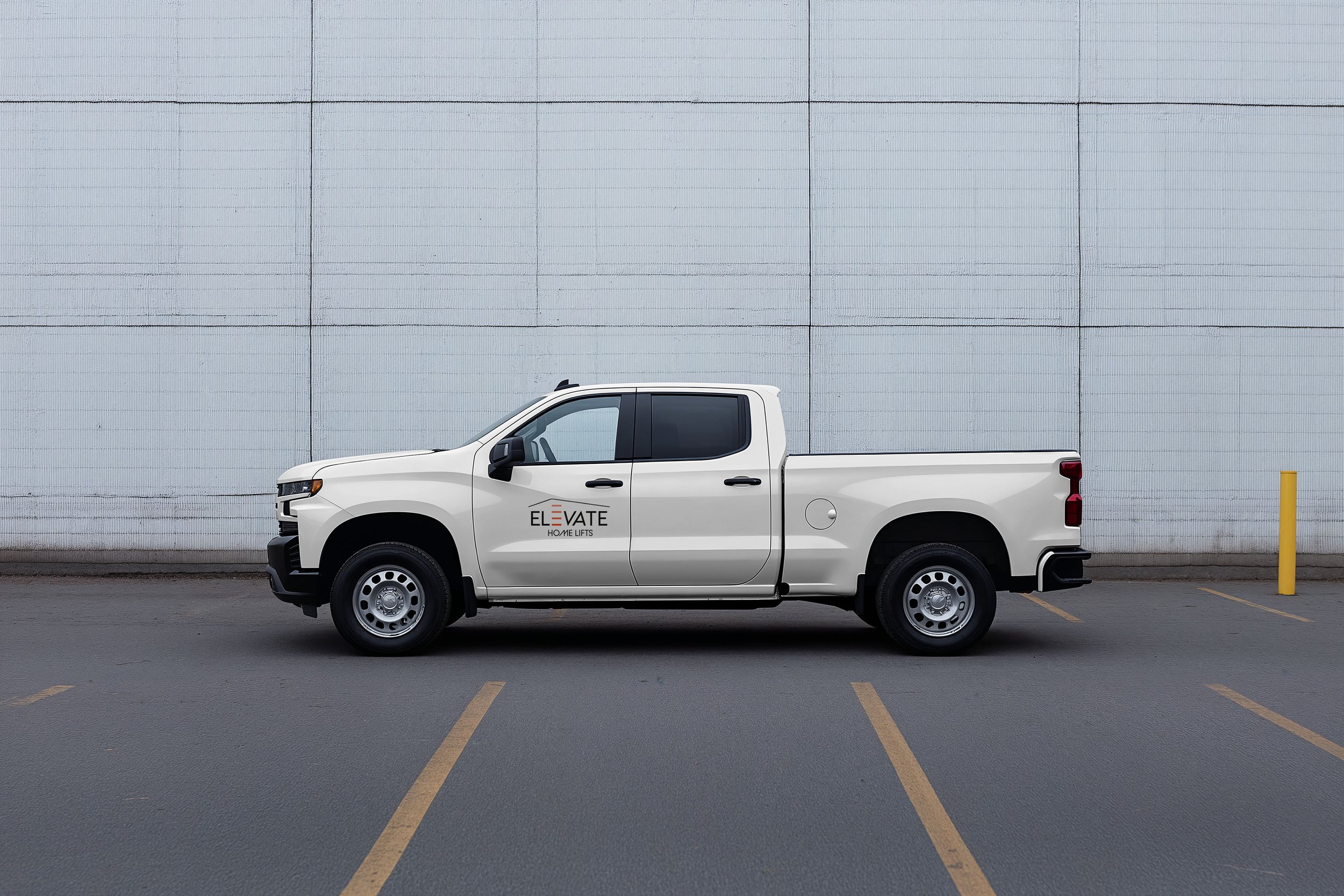
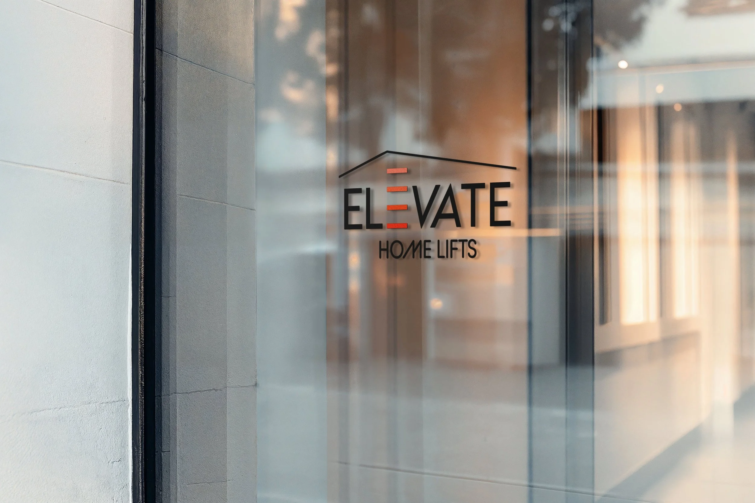
A Cohesive, Connected Identity.
For Elevate Home Lifts, I developed a modern, flexible brand designed to resonate with both homeowners and professional clients. By combining clean, geometric forms with subtle touches of play and movement, the identity balances elegance with approachability.
The result is a cohesive visual language applied across logos, digital platforms, printed materials, and on-site branding, creating a consistent and confident presence across every application. Together, these elements position Elevate Home Lifts as a premium, trustworthy brand within a traditionally conservative industry.